Nobody Scans a Square: What to Put Next to a QR Code
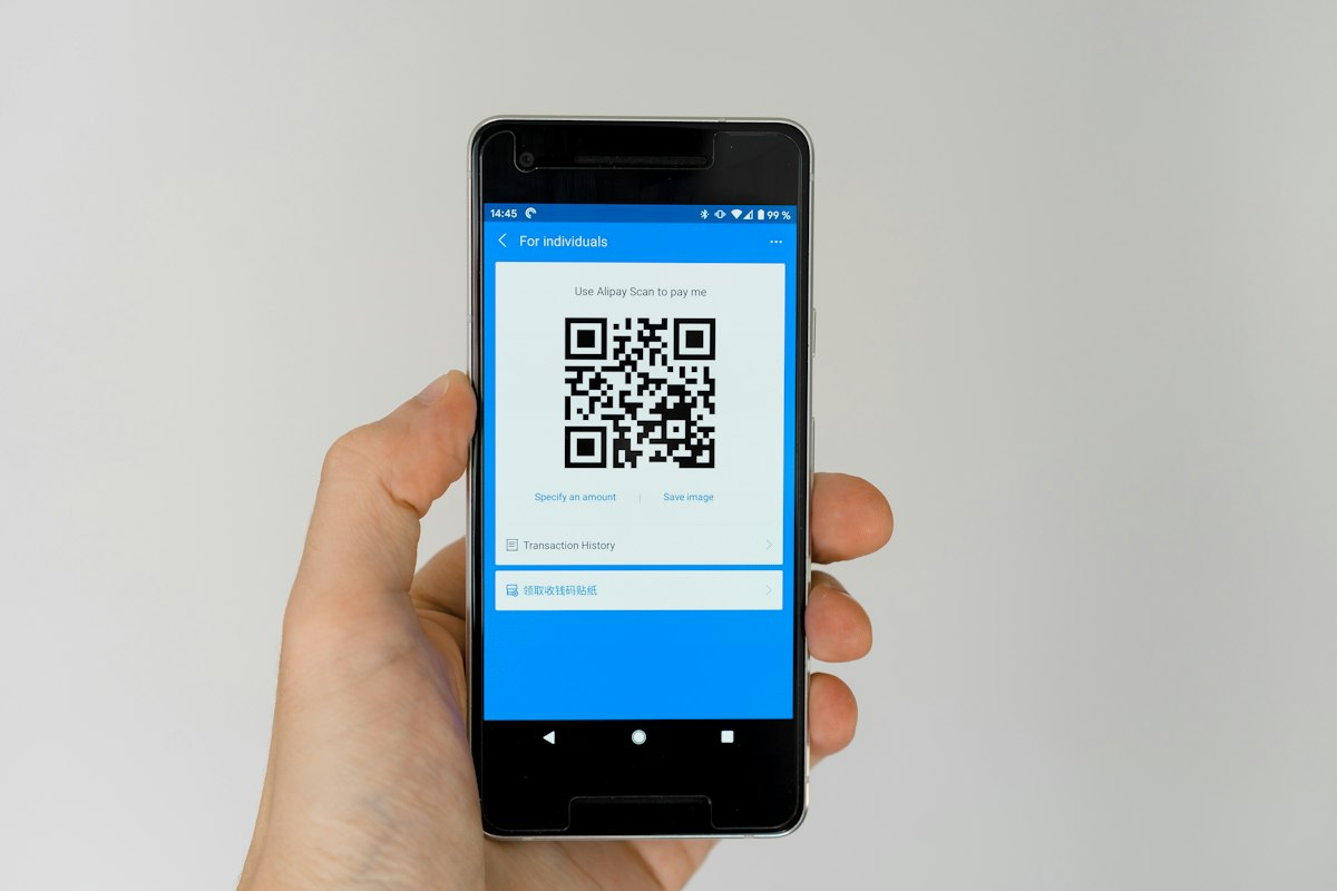
Ask someone to scan a QR code and you are asking them to take their phone out, open the camera, aim it at a thing, wait, and then tap a link to a page they have not seen. That is five small acts of trust for a black square that tells them nothing. Most codes that go unscanned are not badly designed. They are badly introduced — or they are in a place where scanning was never going to happen.
The code itself is the easy half, and we have written the limits of it in QR code design that still scans. This is the other half.
The line beside the code is doing all the work
A QR code is opaque by design — you cannot read it, so you cannot know what is behind it. Everything a person uses to decide comes from what is printed around it. Which means the words next to a code are not a caption. They are the offer.
Three things that line has to do, in this order:
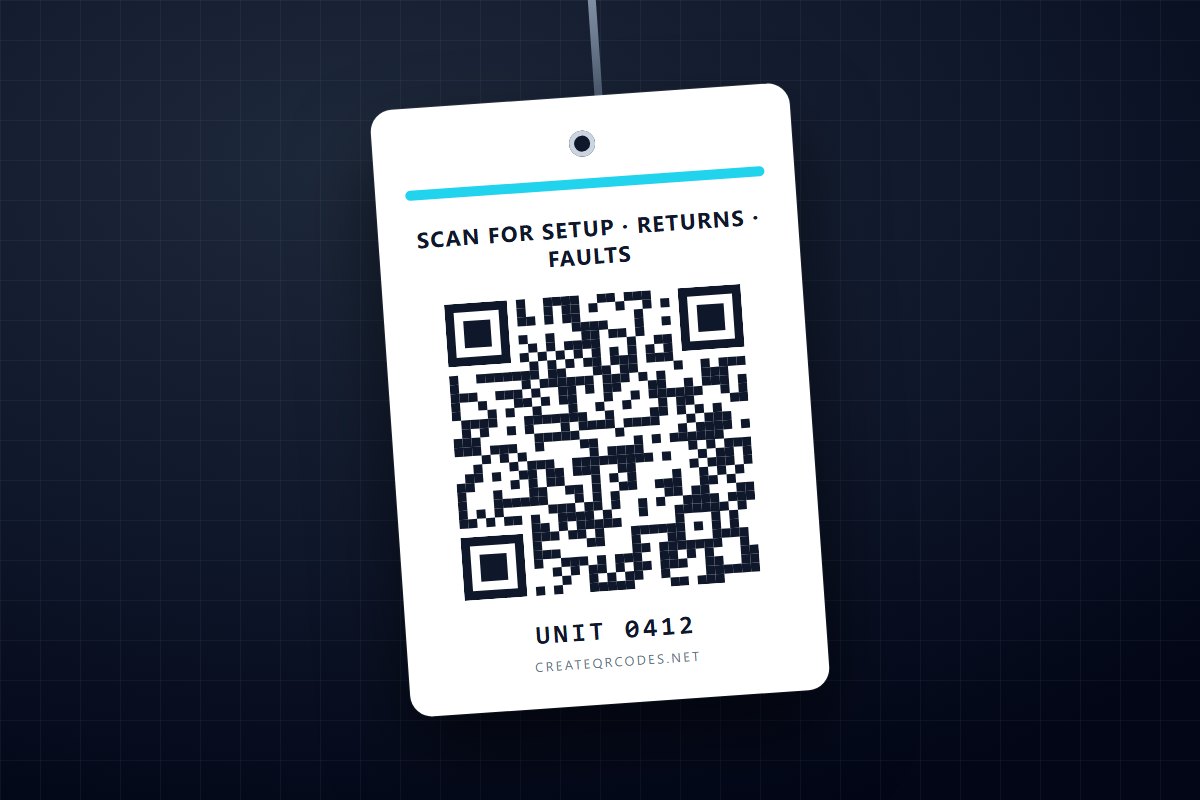
- Say where it goes. Not "Scan me" — that describes the action, which they can already see. "Scan for tonight's menu" describes the destination.
- Say why now. The reason has to be worth the interruption in the exact moment they are standing there. "See the wine list" works at a table. It does nothing on a bus shelter.
- Say what it costs. Silence about whether they will hit a signup wall is read, correctly, as a signup wall. "No app needed" is worth the space it takes.
"Scan me", "Scan here" and a bare code with a logo all fail the first test, which is why they are the three most common things printed next to a code and also the three least effective.
Some shapes that work
These are patterns rather than copy to lift — the specific noun is what makes them work:
- Destination-first. "Full menu, allergens included →" then the code. The person knows what they are getting before they decide.
- Question-answer. "Which size fits? →" on a shelf edge. Only works where the question is one they are actually asking at that moment.
- Time-bound. "Today's specials" or "This week only". Honest urgency; do not manufacture it, because a code that says "today only" and points at an evergreen page teaches people not to scan yours again.
- Removes friction. "Join the wifi — no password to type". The scan is obviously less work than the alternative, which is the strongest possible case.
The test for any of them: would you click this if it were a link in an email? If the answer is no, printing it will not help.
Two failures no wording can fix
Before you spend time on the line, check these — copy cannot rescue either one, and both are extremely common.
1. The code is somewhere a phone cannot go
Scanning needs the person to be still, close enough, and holding a phone. A surprising number of codes are placed where at least one of those is false: on a motorway billboard, on the side of a moving vehicle, on a wall behind a counter you cannot lean over, at ankle height on a floor decal, above head height on a window. In each case the code may be beautiful and the copy perfect and the scan will still not happen.
Rules of thumb worth applying before anything goes to print: put the code roughly between waist and eye level, keep it reachable within arm's length unless it is sized for distance, and make sure a person can stop in front of it without being in anyone's way. The physical-size maths — a code wants to be about one tenth of the scanning distance across — is on the design studio page along with the other format constraints.
2. There is no signal where the code is
This is the one that gets missed in planning, because the person planning has never stood there. Lift lobbies, basements, underground car parks, the back of a warehouse, the inside of a large venue, rural sites — a scan resolves the code instantly and then sits on a page that will not load. From the customer's side that is indistinguishable from a broken code, and it makes them less likely to scan the next one.
Where signal is doubtful, either put the important information in print as well, or use a code type that needs no network at all. Wifi-join, contact-card and plain-text codes all work fully offline because everything they contain is encoded in the code itself.
Print the destination too
Under the code, in small type, put the plain URL. It costs a line and it buys three things: someone with a dead battery or an older phone can still type it; someone cautious can see where they are going before they commit, which is the whole defence described in are QR codes safe; and it survives the code being damaged, obscured or covered by a sticker.
This is also an argument for a short destination. A long tracked URL with parameters is unprintable and unspeakable, and it makes the code denser and harder to scan at the same physical size. Short is better on both counts at once.
One code, one job
A poster with four codes on it — menu, socials, reviews, newsletter — usually gets none of them scanned. Each code needs its own line of copy, and four competing offers in one glance is a decision rather than an action. If a surface genuinely has several things to offer, use one code pointing at a page that lists them; that keeps the decision on the screen, where a person can read at their own pace instead of standing in front of a poster.
The exception is when the codes are physically separated and each sits with the thing it relates to — a code beside each product on a shelf, not four codes on one shelf-talker.
Assume you will get it wrong, and design for that
Almost nobody writes the right line first time, because the right line depends on where the person is standing and what they were already thinking about — and you find that out after it is printed. Two things make being wrong survivable:
- Use a dynamic code so the destination stays editable. A static code encodes the URL permanently; if the page moves, the print is dead. A dynamic code redirects, so the artwork can outlive the campaign behind it. The trade-off — that a dynamic code depends on the redirect service continuing to exist — is set out in static vs dynamic QR codes, and it matters most for anything with a long physical life.
- Look at whether it is being scanned at all. Scan counts will not tell you why a code underperforms, but they will tell you that it does, and they will tell you which of two placements is working — which is the only comparison worth making. How to track QR code scans covers what is and is not knowable.
One honest caveat on measurement: a code with few scans might be badly placed, badly introduced, or simply in front of few people. Scan counts alone cannot separate those, and a number that cannot distinguish between three explanations is not yet an answer. Change one thing at a time.
The short version
- Name the destination, not the action. "Scan for the menu", never "Scan me".
- Give a reason that works in that exact spot, and say if there is no app or signup.
- Check the place first — reachable, still, waist-to-eye level, and with signal.
- Print the URL underneath and keep it short.
- One code, one job.
- Make it dynamic so being wrong is fixable without a reprint.
Get the placement and the line right and an ordinary-looking code outperforms a beautiful one with "Scan me" under it, every time. When you are ready to make the code itself, the design studio covers the constraints it has to respect.